Formatting Text
Learn how to change font, size, case, color, alignment, bold, italic, underline, and highlighting in Microsoft Word.
By the end of this lesson you can
- Apply font, size, color, and emphasis deliberately rather than decoratively
- Explain why bold, italic, and underline carry different conventional meanings
- Use Format Painter to copy formatting from one passage to another
- Recognize when direct formatting should be replaced by a style
Video
Watch the lesson video, then complete the reading and challenge.
Lesson Notes
Read through the key concepts before you try the challenge.
Formatting is communication, not decoration
You are producing a discharge instruction sheet at Lakeside Medical Associates.
A patient needs to know two things above all: take the medication with food, and call immediately if a fever passes 101°F. You have written both. They sit in the middle of a wall of identical gray text, and the patient will read neither.
Your task: Use formatting to make the most important information impossible to miss — and to make everything else recede.
Emphasis works by contrast, which means it is a budget. If you bold six things on a page, you have bolded nothing — the reader's eye has no landing place. A page with two bold phrases directs attention exactly where you want it. The discipline is not learning what the buttons do; it is restraint about how often you press them.
Conventions matter too, because readers have absorbed them. Bold signals importance and survives scanning. Italic signals a title, a term being defined, or a mild emphasis, and it is harder to read in long runs. Underline, on screen, reads as a hyperlink — underlining ordinary text is the fastest way to make readers click something that is not there. Use bold for emphasis and reserve underline for links.
| Treatment | Conventional meaning | Avoid |
|---|---|---|
| Bold | This is critical; do not skip it | More than two or three per page |
| Italic | Title of a work, a defined term, or light emphasis | Long passages — it slows reading |
| Underline | A hyperlink | Ordinary emphasis, on screen especially |
| ALL CAPS | Short labels and warnings only | Sentences — capitals remove word shape and slow reading |
| Color | Category or status, when there is a legend | Color alone as the only signal — it fails for colorblind readers |
Text Alignment
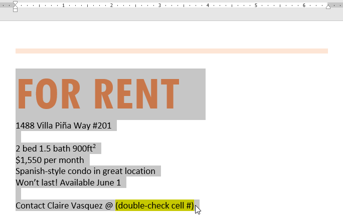
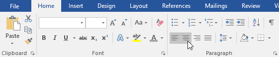
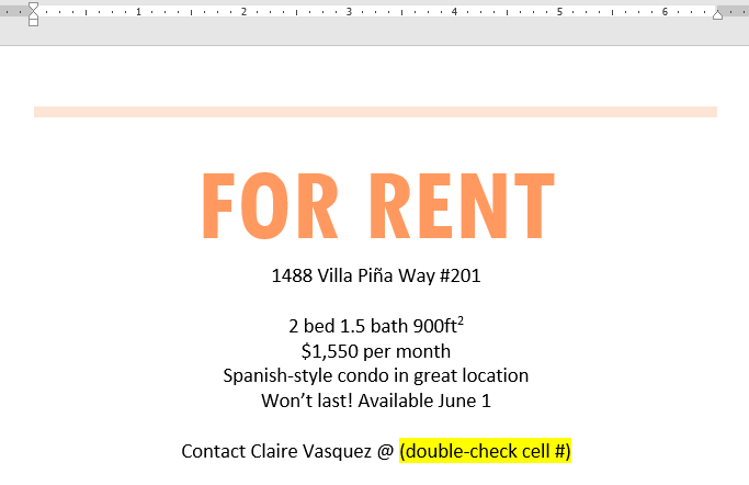
Alignment controls how text is positioned between the margins. You can align text to the left, center, right, or justify it.
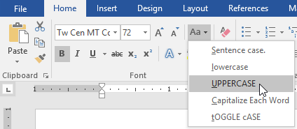
Changing Text Case
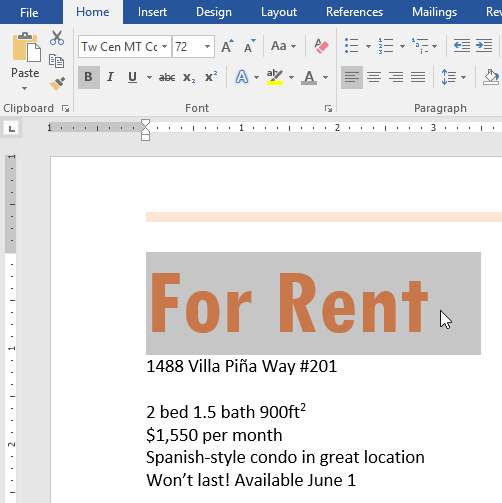
The Change Case command allows you to quickly convert text to uppercase, lowercase, or capitalize each word.

Changing Font Type
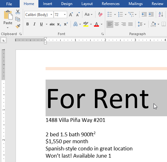
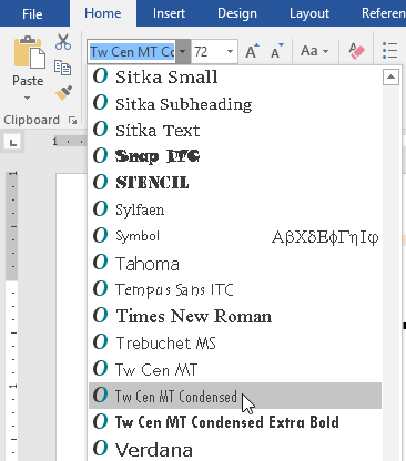
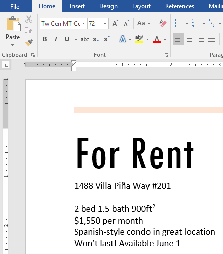
You can change the font style from the Font dropdown menu in the Home tab.
Changing Font Size
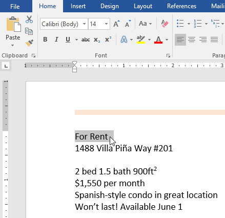
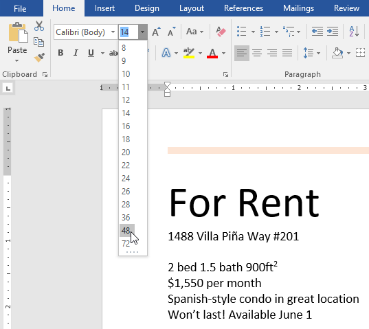
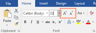
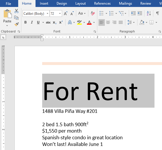
Adjust font size using the size dropdown menu or the Increase/Decrease Font Size buttons.
Changing Font Color
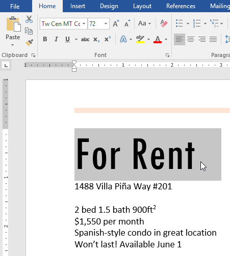
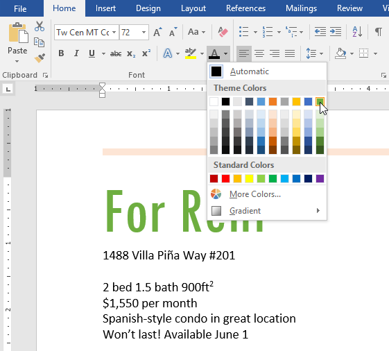
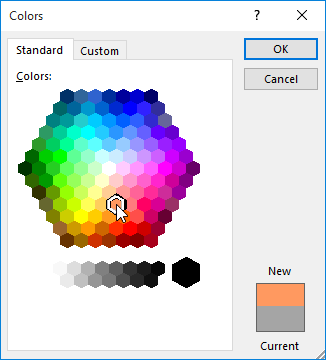
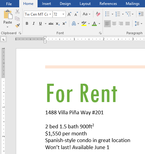
Use the Font Color dropdown to apply theme colors or choose custom colors.
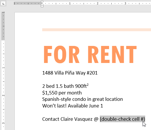
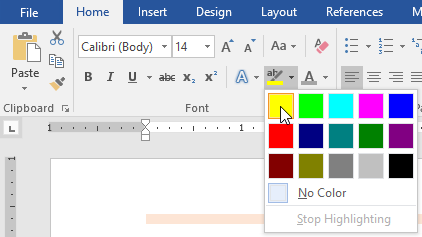
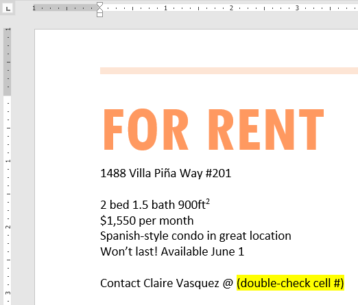
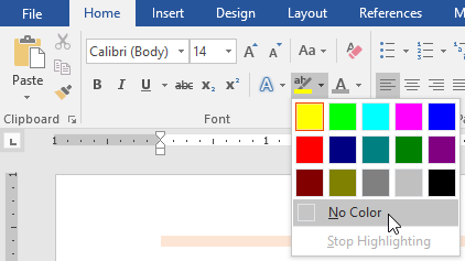
Text Highlighting
The Text Highlight tool allows you to emphasize important information.
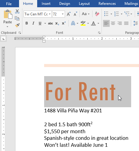
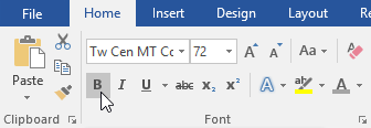
Bold, Italic, and Underline
Use Bold, Italic, and Underline to emphasize text.
Final Result
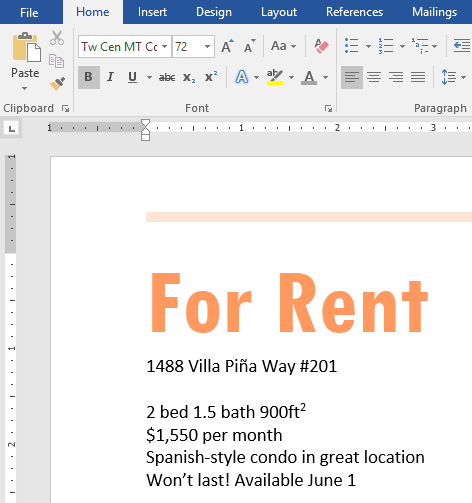
After applying alignment, case changes, font adjustments, color, highlighting, and emphasis, your completed document should look like this:

Knowledge Check
Which formatting option makes text appear slanted?
Practice File
Download this file and follow along with the lesson.
Challenge
Apply what you've learned in this lesson.
Using the provided practice file, complete the following tasks:
- Change the title to ALL CAPS.
- Center-align the main heading.
- Increase the font size of the title to 72pt.
- Change the font color of the title.
- Apply bold formatting to the price.
- Highlight the contact phone number.
- Modify the font style of the title.
Finished this lesson?
Progress is saved in this browser only. It is not a grade — official progress lives in Brightspace.