Creating Charts in Excel
Learn how to visualize data in Excel using charts. Charts help transform raw numbers into visual insights that make trends, comparisons, and patterns easier to understand.
Video
Watch the lesson video, then complete the reading and challenge.
Lesson Notes
Read through the key concepts before you try the challenge.
Why Charts Matter
Charts turn raw numbers into something your brain can understand in two seconds. They help you spot trends, compare categories, and present data clearly in reports.
A finished chart should clearly communicate the story your data is telling.
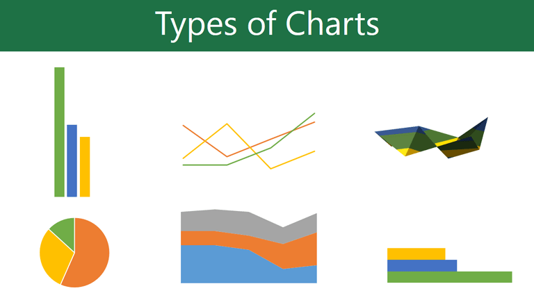
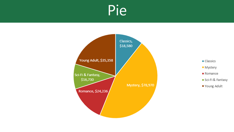
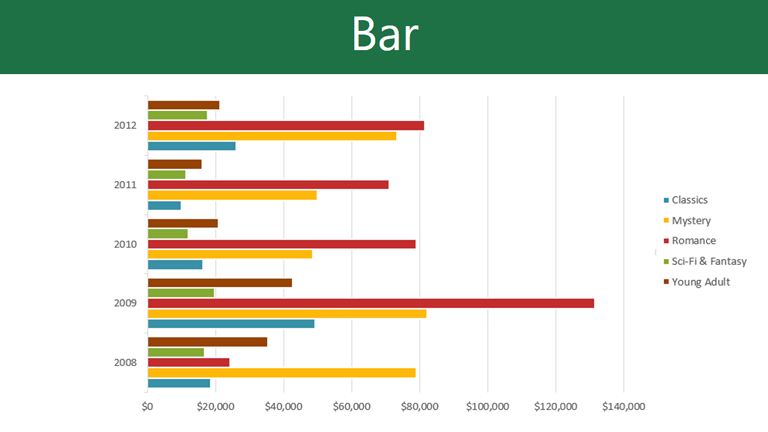
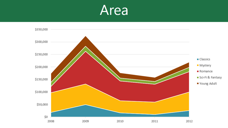
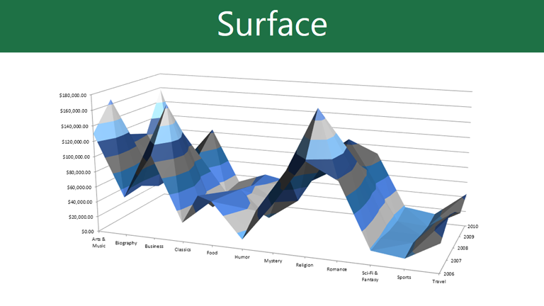
Common Chart Types
Excel offers many chart types. The key is choosing the one that matches your goal: compare categories, show change over time, or show parts of a whole.
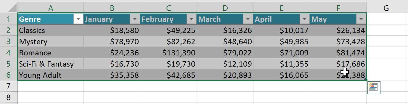
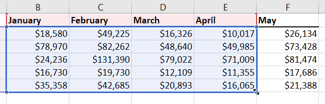
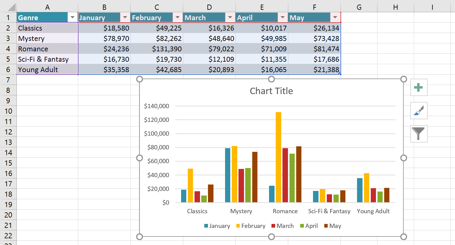
Step 1: Select Your Data
Before inserting a chart, select the full range of data you want Excel to chart, including headings. Excel uses headings for the legend and axis labels.
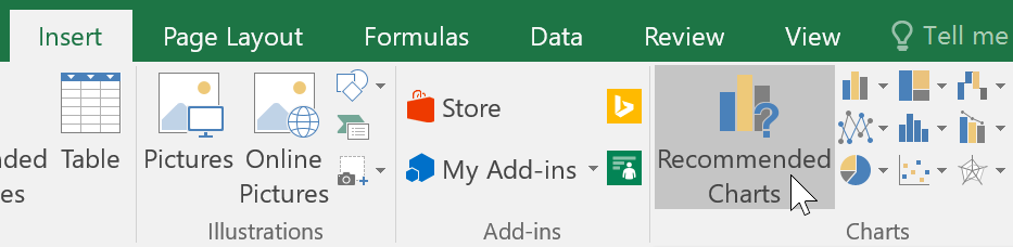
Step 2: Insert a Chart
Go to the Insert tab. You can use Recommended Charts to let Excel suggest the best chart, or pick a chart type directly from the Charts group.
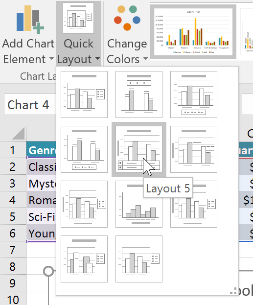
Quick Layout
Quick Layout is the fastest way to make a chart look presentable. It adds titles, labels, and legend arrangements with one click.
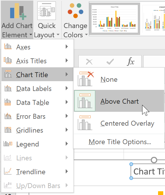
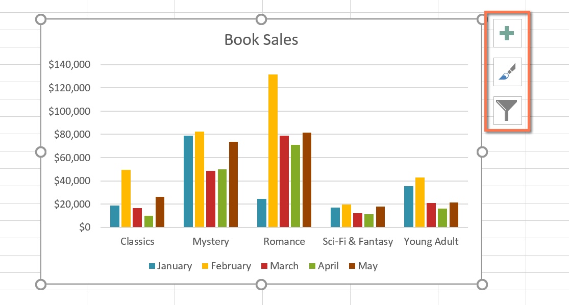
Add Chart Title and Elements
Use the green + button (Chart Elements) to add a Chart Title, Axis Titles, Data Labels, and more.
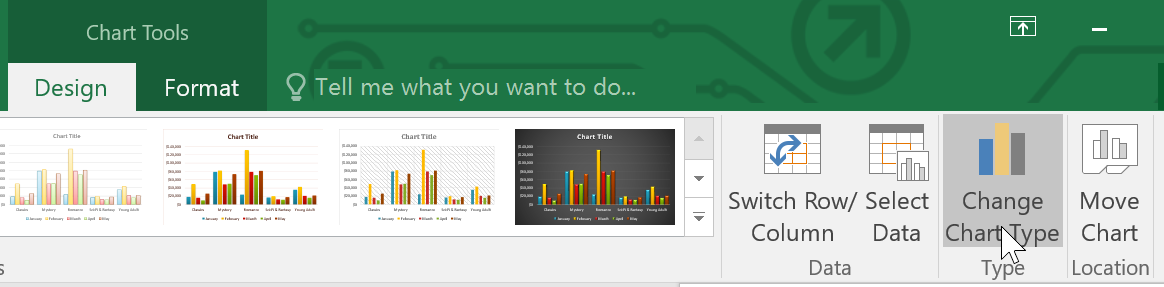
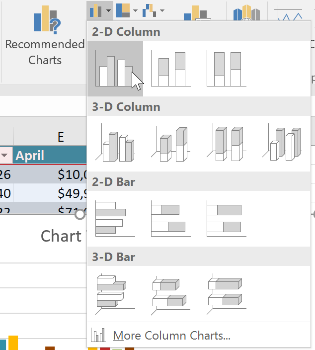
Change Chart Type
If you pick the wrong chart type, no problem. Select the chart → Chart Design → Change Chart Type.
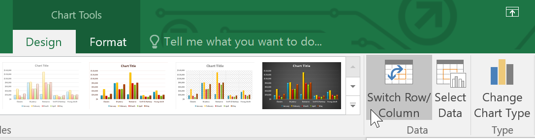
Switch Row/Column
If your chart looks backwards (wrong categories/series), use Switch Row/Column to flip how Excel reads the data.
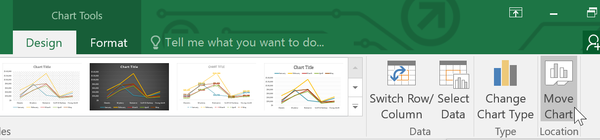
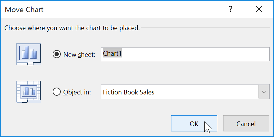
Move Chart to a New Sheet
To make charts cleaner and easier to present, move them onto their own chart sheet: Chart Design → Move Chart.
Knowledge Check
Which chart type is best for showing how individual parts make up a whole?
Practice File
Download this file and follow along with the lesson.
Challenge
Apply what you've learned in this lesson.
Download and open the practice workbook. Complete the following:
- Select the full dataset (including headings).
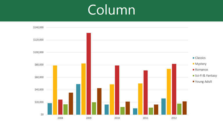
- Insert a Column chart using Recommended Charts.
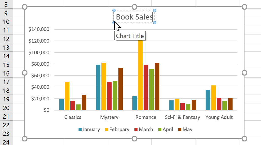
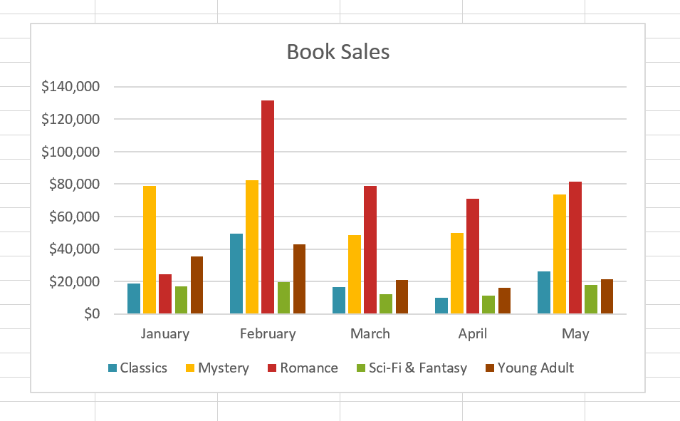
- Add a Chart Title: Book Sales.
- Use Quick Layout to add labels/titles if needed.
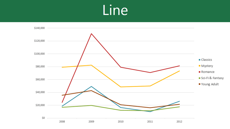
- Change the chart type to Line.
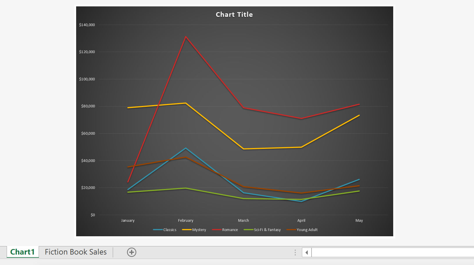
- Use Switch Row/Column to compare how the data changes.
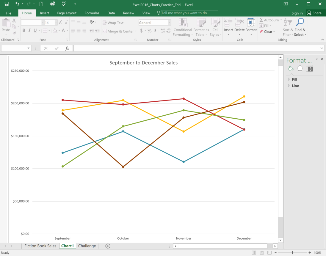
- Move the final chart to a new chart sheet named Chart1.