Creating Professional Documents
Learn how to produce clean, well-structured documents that represent your organization professionally.
Video
Watch the lesson video, then complete the reading and challenge.
Presentation Slides
Review the slides below, then complete the reading and challenge.
Lesson Notes
Read through the key concepts before you try the challenge.
Real-World Scenario
Document Structure & Formatting
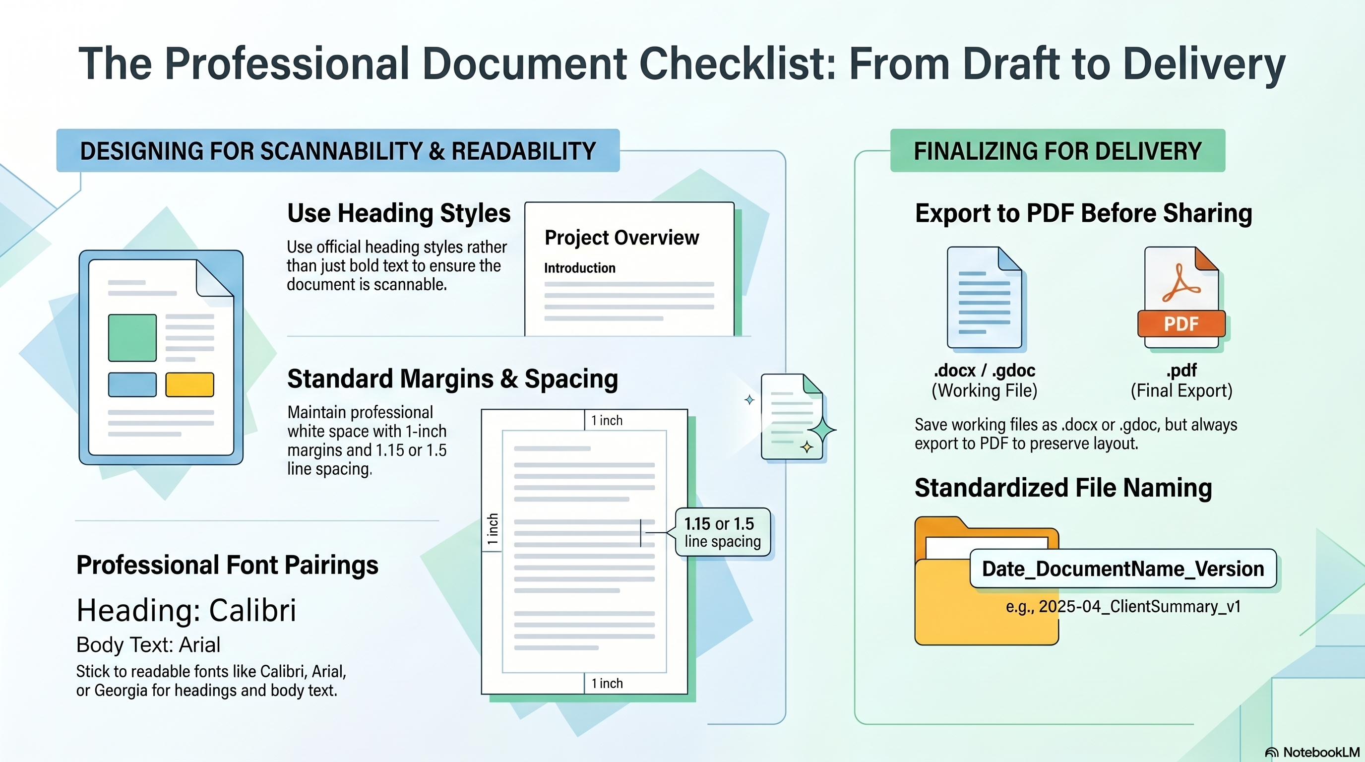
A professional document communicates clearly before anyone reads a single word. Structure and formatting signal competence — a well-formatted page tells the reader you are organized, detail-oriented, and take your work seriously. Here is the anatomy of every professional document:
- Every document needs a title, clearly labeled sections, and a logical flow from top to bottom — readers should never have to hunt for what they are looking for
- Use heading styles (Heading 1, Heading 2) from the Styles panel — not just bold text — so the document is scannable and navigable
- Professional fonts only: stick to Calibri, Arial, or Georgia. Use one font for headings and a different complementary font for body text
- Standard 1-inch margins on all four sides and 1.15 to 1.5 line spacing for optimal readability and professional white space
- Never mix more than two fonts in a single document — inconsistent typography is one of the most common signals of an amateur document
- Always start from structure: set your title and section headers first, then fill in body content — never start with a wall of text
Working Files vs. Delivery Files
Two file formats serve two distinct purposes in professional document work. Knowing when to use each is a non-negotiable workplace skill:
- .docx / .gdoc — The Working File: Save in this format while you are drafting and editing. It remains fully editable and is what you keep in your files.
- .pdf — The Presentation File: Always export to PDF before sharing a document externally. This locks the layout and preserves your deliberate formatting exactly as designed, no matter what software the recipient uses.
- Never send a raw .docx to a client unless they specifically request an editable version — an editable file exposes your drafting process and can be accidentally modified.
Quick Reference: The Professional Document Checklist
The Professional Document Checklist: From Draft to Delivery
Responsible Use
Professional File Naming
Professionalism extends to the file directory. A consistent naming convention gives every document instant context — who made it, what it is, and which version — without opening the file:
- Use the format: Date_DocumentName_Version — for example, 2025-04_ClientSummary_v1
- Use YYYY-MM date format so files sort chronologically in any folder view
- Increment version numbers when making significant revisions (v1 → v2 → v3)
- Never use spaces in file names — use underscores or hyphens instead, which prevents errors when files are shared across systems
AI Assist
Knowledge Check
What format should you use when sharing a professional document externally?
Challenge
Apply what you've learned in this lesson.
Create a one-page professional summary document on any workplace topic of your choice (for example: 'Benefits of Cloud Storage' or 'Why Organized Communication Matters'). Your document must meet all five specifications below:
- Include a main title using a proper Title or Heading 1 style — not bold text
- Include at least 2 clearly labeled sections using proper Heading styles
- Format body text with 1-inch margins and 1.15 to 1.5 line spacing
- Apply a consistent font pairing (e.g., Calibri for headings, Arial for body text)
- Name the file using the convention: YYYY-MM_TopicName_v1
Practice Exercises
Apply what you've learned — complete the quick check and hands-on exercise below.
Quick Check
Test your understanding before the main exercise
What's wrong with using bold text instead of a Heading style for section headers?
Document Review Exercise
Evaluate a submitted document against professional formatting standards
The Submission
A colleague named Marcus submitted document "Q2 Client Summary" to be shared with a client. Review the details below and evaluate each criterion.
- Title: Includes a title at the top: Q2 Client Summary
- Section Headers: Section headers created by bolding and enlarging the text manually
- Font Choices: Comic Sans used for headings; Times New Roman for body text
- Margins & Spacing: 1-inch margins on all sides, 1.5 line spacing throughout
- File Sent As: Q2 Client Summary.docx — emailed directly to the client
For each criterion below, select Pass or Fail:
The document includes a proper title
Section headers use proper Heading styles, not just bold text
Professional fonts are used (Calibri, Arial, or Georgia)
Standard margins (1 inch) and proper line spacing (1.15–1.5) are applied
The file was exported as a PDF before sharing externally