Doing More with PivotTables
Learn how to perform deeper analysis with PivotTables by filtering, grouping, and refreshing summarized data.
By the end of this lesson you can
- Add slicers and timelines as visual filters
- Group dates and numeric values into meaningful bands
- Change value calculations to show percentages and running totals
- Connect one slicer to several PivotTables
Video
Watch the lesson video, then complete the reading and challenge.
Lesson Notes
Read through the key concepts before you try the challenge.
Making a PivotTable usable by someone else
You build the spending dashboard at Lakeside Medical Associates.
The practice manager needs to look at one department at a time. Explaining the PivotTable field list means explaining Rows, Columns, Values, and Filters. Adding a slicer means saying 'click the department you want.'
Your task: Add controls that let a non-Excel user explore the data without instruction.
A slicer is a filter with buttons. It does exactly what the Filters area does, but visibly — and crucially, it shows the current filter state, so nobody misreads a filtered table as the full picture. That failure mode is common enough with the Filters dropdown to justify slicers on its own.
A timeline is the equivalent for dates: a slider for choosing months, quarters, or years. Both can be connected to several PivotTables at once through Report Connections, so one click filters an entire dashboard consistently.
Filtering PivotTables
PivotTables allow you to filter data to focus on specific information. You can filter by fields such as Salesperson, Region, or Month to quickly analyze subsets of your dataset.
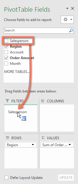
To filter a PivotTable, drag a field such as Salesperson into the Filters area of the PivotTable Fields panel.
Filtering Multiple Items
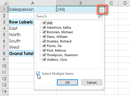
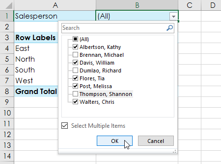
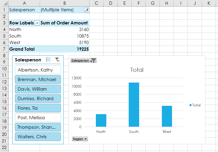
You can filter multiple values from a PivotTable field. Select the filter dropdown, enable Select Multiple Items, and choose the items you want to analyze.
Using Slicers for Visual Filtering
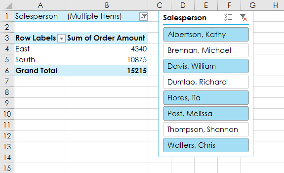
Slicers provide a visual way to filter PivotTable data. Instead of dropdown menus, slicers use clickable buttons that allow you to filter data quickly.
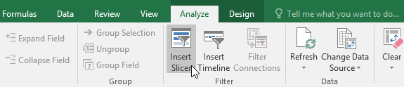
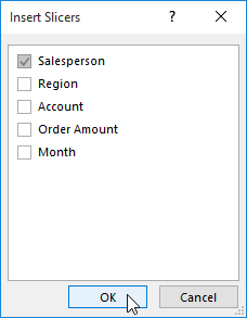
To insert a slicer, select the PivotTable and go to PivotTable Analyze → Insert Slicer.
Filtering with Slicers
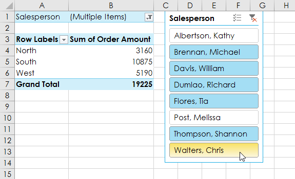
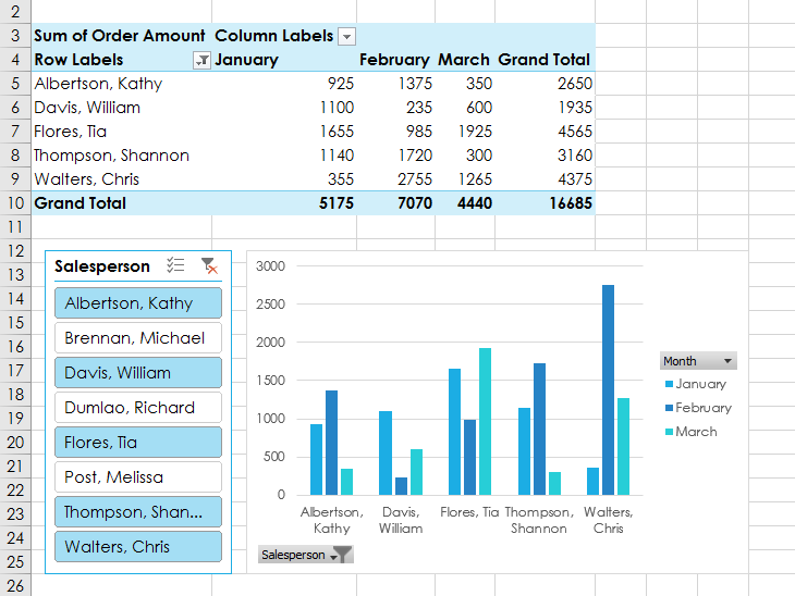
You can click individual buttons in the slicer to filter the PivotTable instantly. Hold Ctrl to select multiple items.
Creating PivotCharts
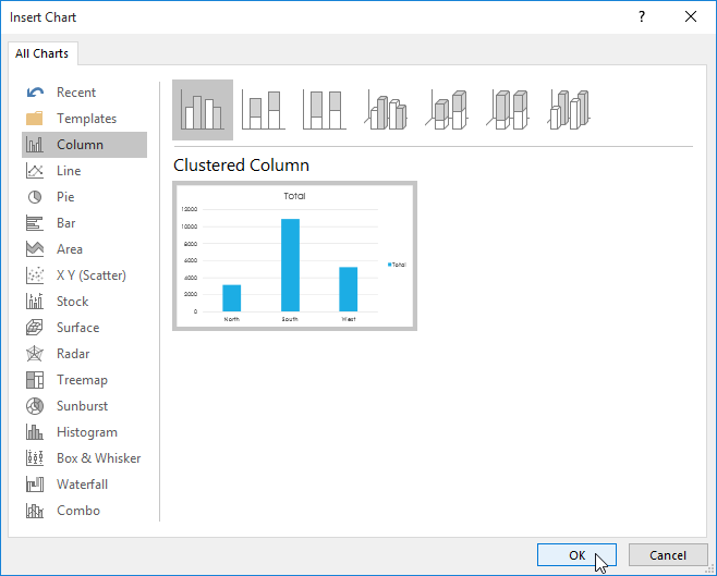
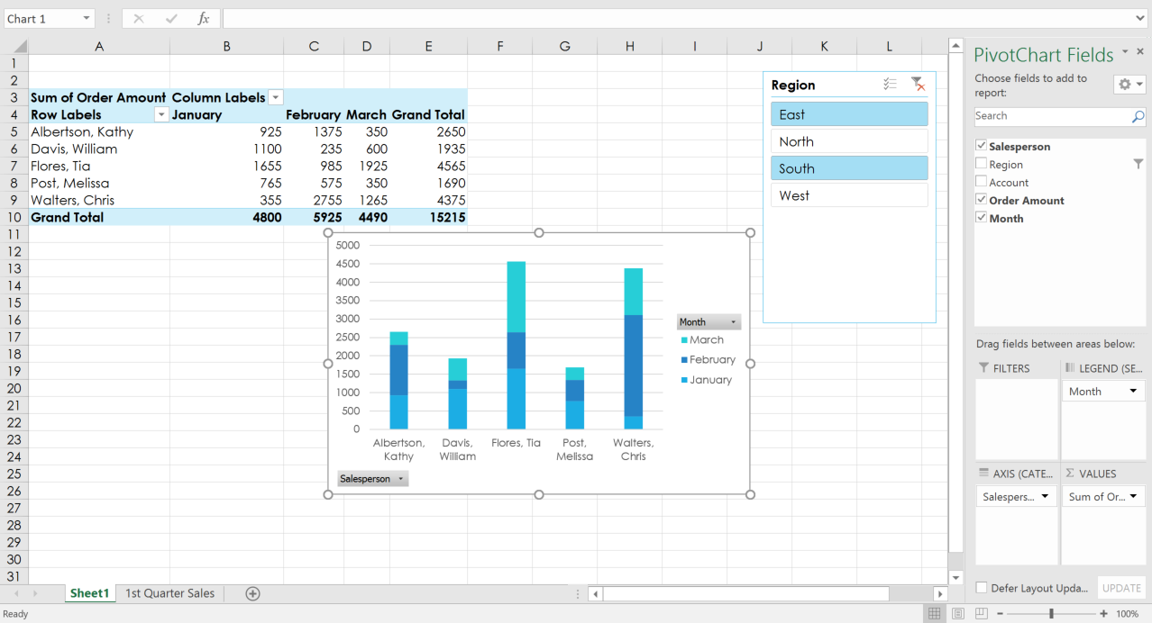
PivotCharts allow you to visualize PivotTable data in a chart format. When the PivotTable changes, the chart updates automatically.
Select the PivotTable and go to Insert → PivotChart.

Interacting with PivotCharts
PivotCharts remain connected to their PivotTables. When filters or slicers change, the chart updates automatically.
Final Result
After applying filters, slicers, and charts, you can quickly analyze patterns in your dataset. PivotTables and PivotCharts together provide powerful tools for summarizing and visualizing data.
Knowledge Check
What does a Slicer do in a PivotTable?
Practice File
Download this file and follow along with the lesson.
Challenge
Apply what you've learned in this lesson.
- Open the practice workbook.
- Create a PivotTable from the dataset.
- Add Salesperson to Filters.
- Filter the PivotTable to show only two salespeople.
- Insert a Slicer for Salesperson.
- Use the slicer to change which salespeople appear.
- Create a PivotChart to visualize the sales totals.
Finished this lesson?
Progress is saved in this browser only. It is not a grade — official progress lives in Brightspace.