Basic Tips for Working with Data
Learn how Excel helps you organize, sort, filter, summarize, and visualize large amounts of information efficiently.
By the end of this lesson you can
- Structure a data range so Excel's data tools work correctly
- Explain why one row per record and one column per field matters
- Avoid the layout choices that break sorting and filtering
- Use Data Validation to prevent bad entries at the source
Lesson Notes
Read through the key concepts before you try the challenge.
Excel's data tools assume a shape
You inherit the supply log at Lakeside Medical Associates.
The sheet has a title in A1, two blank rows, merged headings, a blank row separating each month, and totals in the middle of the data. Sorting scrambles it, filtering catches only the first month, and a PivotTable refuses to build at all.
Your task: Learn the layout Excel's data tools expect, because every one of them assumes it.
Sorting, filtering, subtotals, tables, and PivotTables all assume the same structure: one header row, one record per row, one field per column, and no blank rows or columns inside the data. Meet that and every tool works. Break it and each tool fails in its own confusing way.
| Rule | Why | Common violation |
|---|---|---|
| One header row | Tools read row 1 as field names | A title above the headers, or two header rows |
| One record per row | Each row is treated as a unit when sorted | One item's data split across two rows |
| No blank rows inside the data | A blank row is read as the end of the range | Blank rows used as visual separators |
| No merged cells | Merging destroys the row and column grid | Merged section headings |
| Totals outside the data | A total inside the range sorts along with the data | A subtotal row in the middle of the records |
| One type per column | Mixed text and numbers break sorting and summing | Notes typed into a numeric column |
Introduction
Excel workbooks are designed to store a large amount of information. Whether you are working with 20 rows or 20,000, Excel includes powerful tools to help you organize your data and quickly find what you need.
Instead of manually scanning thousands of cells, you can use built-in features like freezing panes, sorting, filtering, subtotals, tables, charts, and conditional formatting to work smarter.
Freezing Rows and Columns
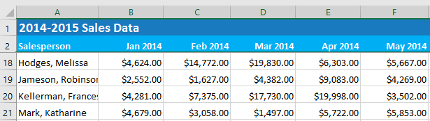
When working with large datasets, header rows can scroll off the screen. Freezing panes keeps important rows or columns visible while you scroll.
This is especially useful for date headers, employee names, or product categories.
Sorting Data
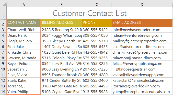
Sorting reorganizes your worksheet so that data appears in a specific order. You can sort alphabetically, numerically, by date, or even by color.
For example, you might sort a customer list by last name or sales data from highest to lowest.
Filtering Data
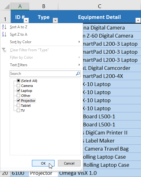
Filters allow you to narrow down a worksheet to display only the information that meets certain criteria.
Instead of deleting rows, filtering temporarily hides data that does not match your selection.
Summarizing Data with Subtotals
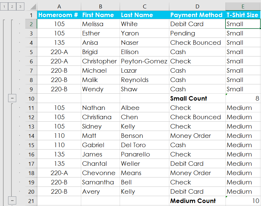
The Subtotal command automatically groups data and calculates totals for each category.
This is useful when analyzing grouped information such as sales by region or inventory by category.
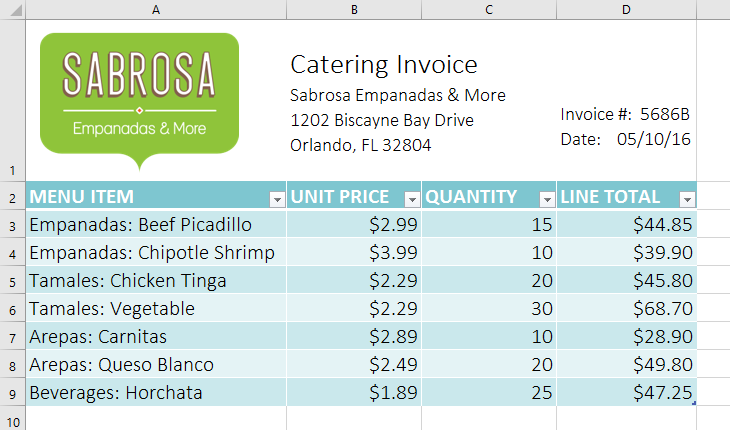
Formatting Data as a Table
Formatting data as a table improves both appearance and functionality. Tables include built-in filtering and sorting, and they automatically expand when new data is added.
Excel includes predefined table styles that make formatting fast and consistent.
Visualizing Data with Charts
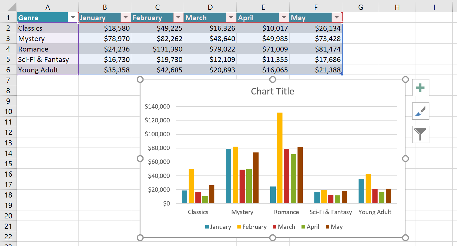
Large datasets can be difficult to interpret at a glance. Charts transform raw numbers into visual comparisons and trends.
Charts are useful for identifying patterns, growth, declines, and performance differences.
Conditional Formatting
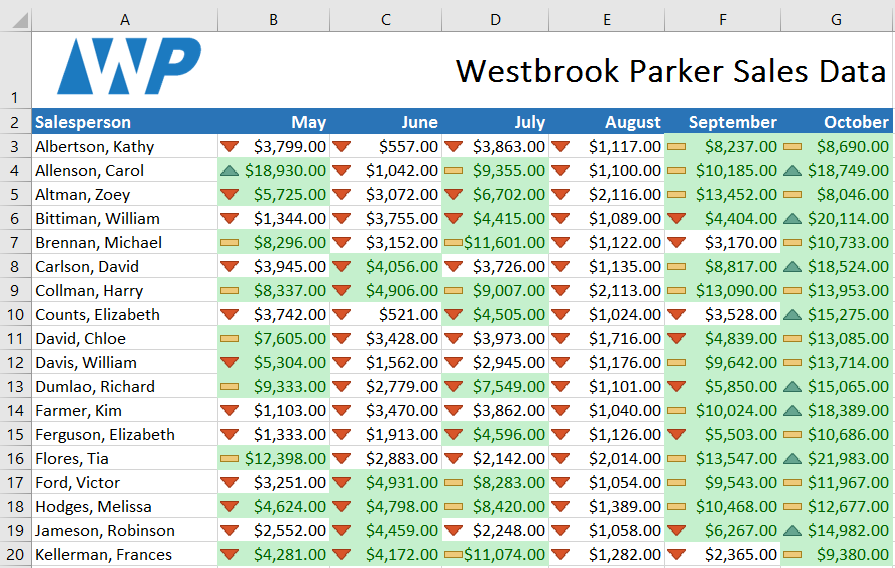
Conditional formatting automatically changes the appearance of cells based on their values.
You can apply color scales, data bars, or icons to quickly highlight trends and outliers.
Using Find and Replace
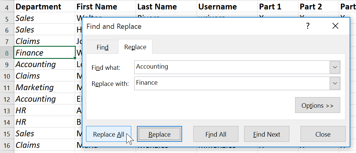
When working with large worksheets, locating specific information can be time-consuming.
The Find feature searches your workbook instantly. Replace allows you to modify multiple instances of text at once.
Knowledge Check
Which Excel feature highlights cells based on rules you define?
Challenge
Apply what you've learned in this lesson.
Using a worksheet with at least 20 rows of data, complete the following:
- Freeze the top row so headers remain visible.
- Sort one column alphabetically or numerically.
- Apply a filter to display only specific rows.
- Format the dataset as a table.
- Create a chart to visualize one column of numeric data.
- Apply conditional formatting to highlight the highest values.
- Use Find and Replace to change one repeated value in the worksheet.
Finished this lesson?
Progress is saved in this browser only. It is not a grade — official progress lives in Brightspace.